01 · The painting
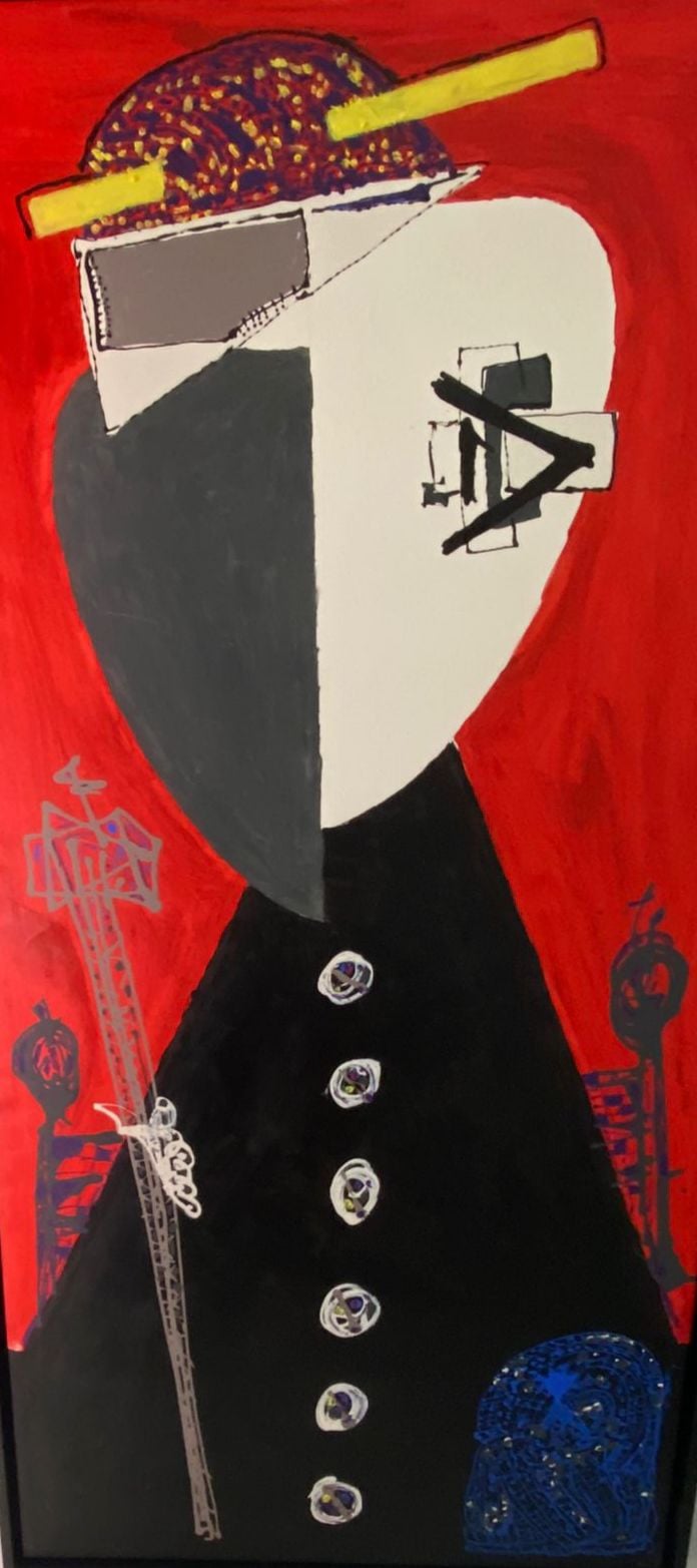
The original painting with the face and the stroke across the eye.
Antaeus and The Cleric. Two roots that explain why we look at data the way we do. Greek mythology and contemporary art — not consultancy-as-usual.
Son of Poseidon (god of the sea) and Gaia (goddess of the earth). His strength grew each time he touched the ground — his mother, the earth, renewed his energy.
This is not a metaphor chosen at random. Every project brings us back to the essentials: the data, the people who govern it, the business that needs it. That is our resilience.
Antaeus challenged travellers to fight. He always won: every time he fell, his strength was renewed. He never stayed down.
Resilience and continuous renewal. Connecting to the fundamentals, having a solid base, returning to the essential. That is what we do with data.
At Anteodata we draw inspiration from the work of Antonio Suárez Chamorro, «The Cleric». The eye depicted in the canvas symbolises our ability to observe, analyse and understand every detail of the data.
We leave no stone unturned. We look for the crucial information — the kind that transforms businesses and generates value. That piercing gaze — neither distracted nor superficial — is the editorial principle behind everything we do.
More than 30 years of craft have taught us that strategic vision is trained. The eye is not born: it learns by looking, project after project.
Anteodata's anagram is not a design added on top. It is the exact stroke the artist painted on the Cleric's face.
The original painting with the face and the stroke across the eye.
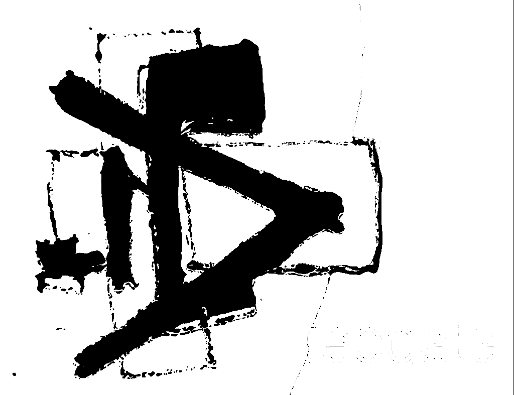
Extracted from the canvas, it keeps its painterly gesture.
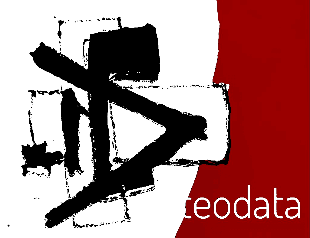
Accompanied by the corporate name.
What the Cleric observes on the canvas, we apply each day to data.
Attentive to opportunities and threats. Nothing escapes the analysis.
Clarity, integrity and verified data. A partner you can rely on.
No detail overlooked. Effective and aligned with the objectives.
Technological front-line with purpose. No novelty for novelty's sake.
Solidity, clarity and accent. There is no fourth colour — what is accessory does not define a brand.
Contemporary sans-serif, condensed weight. Titles with character, legible body.
The logo keeps its manual texture. Not cleaned, not vectorised: it is a gesture, not an icon.
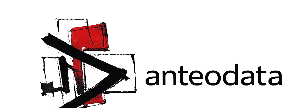
The Art of Transforming Data into Knowledge.
Governed, disruptive and non-invasive solutions.
— Anteodata corporate signatureThe eye and the craft belong not to a brand: they belong to a team.